
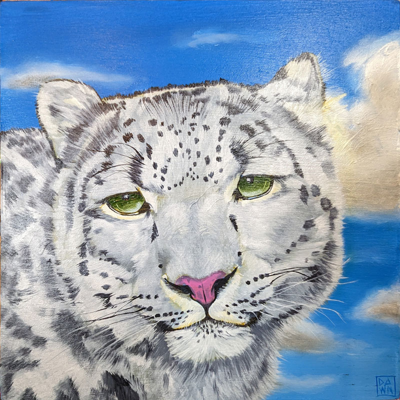
 "Snow Leopard" Oil on Panel, 8″ x 8″ $35.00 – $200.00
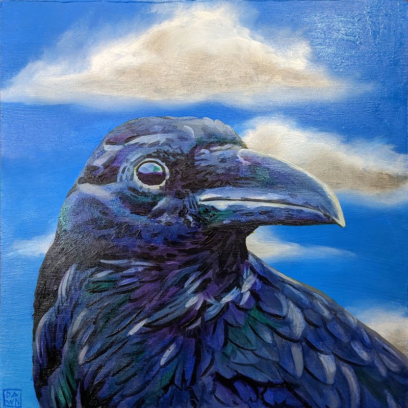
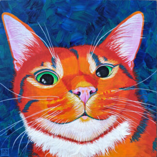 "Clemens" Acrylic on Panel, 8″ x 8″ $35.00 – $200.00
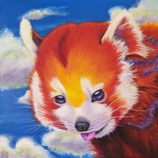 "Reginald" Art Print $30.00
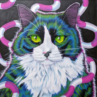 "Candy Ribbon Loki" Oil on Panel, 12″ x 12″ $35.00 – $500.00
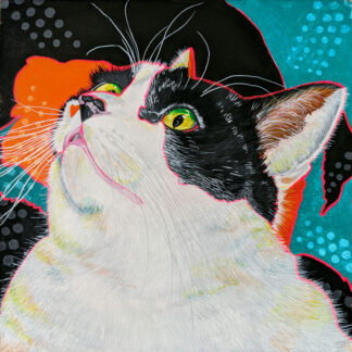 "Callie" Acrylic on Canvas, 12″ x 12″ $35.00
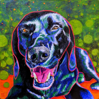 "Buster" Art Print $35.00